![OmniByte - PNG Black Logo Oct 2021 (1).png]](https://help.omnibyte.com/hs-fs/hubfs/OmniByte%20-%20PNG%20Black%20Logo%20Oct%202021%20(1).png?height=50&name=OmniByte%20-%20PNG%20Black%20Logo%20Oct%202021%20(1).png)
Once you’ve added an input field to your form, click on it to start customizing. A sidebar will slide out on the right side of the Form Designer. From there, you can adjust the input’s settings to fit your exact needs—making form building simple and flexible.
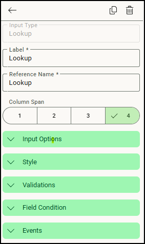
This slider is where you can view and edit details about the selected input, including:
-
Label and Reference Name: These identify your input field, both for display and internal use.
-
Column Span: Choose how many columns wide the input should be in your form layout.
-
Input Options: Depending on the type of input (checkbox, radio, text), you can define options such as required fields, default values, and personal data.
-
Styles: Adjust how the input appears by customizing font, color, and size.
-
Validations: Set rules for the input to ensure users enter data correctly.
-
Field Conditions: Create logic to show or hide the input based on values from other fields.
-
Events: Add interactive behaviors for lookup and select inputs, like triggering actions when the input is changed.
Additionally, from the slider, you can quickly copy the input to duplicate its settings or delete it if it’s no longer needed.
Click  (Back) to return to the Form Designer's menu.