![OmniByte - PNG Black Logo Oct 2021 (1).png]](https://help.omnibyte.com/hs-fs/hubfs/OmniByte%20-%20PNG%20Black%20Logo%20Oct%202021%20(1).png?height=50&name=OmniByte%20-%20PNG%20Black%20Logo%20Oct%202021%20(1).png)
The Input Options section of the input slider allows you to configure settings for an individual form input. These settings determine how the input behaves, how information is displayed to users, and how data is collected within the form.
The options available in this section vary based on the selected input type. For example, a Text input includes settings specific to text entry, while other input types, such as dropdowns, checkboxes, or date inputs, provide their own unique configuration options.
The following illustration displays a Text input to show the available settings and functionality. If you are working with a different input type, options may appear differently or may not be available.
For detailed information about the settings, behavior, and best practices for a specific input type, refer to that input type’s dedicated knowledge article.
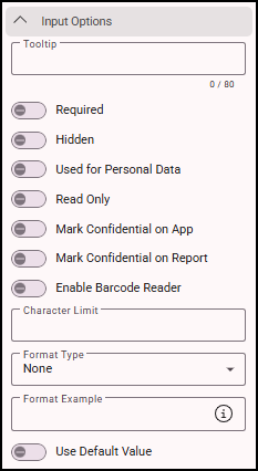
To access input options, click on an input to open its slider and expand Input Options.
Most input types share a set of common configuration options. These options include:
-
Tooltip: Add a hint or tip to guide users filling out the field.
-
Required: Make the field mandatory.
-
Hidden: Hide the field in the app.
-
Used for Personal Data: Toggle on if the field contains personal data. When using the Data Deletion page, personal data will be removed while keeping non-personal data for analysis. Once selected, a personal data icon appears next to the text alignment icon in the Admin site.

-
Read Only: Prevent editing by making the field read-only.
-
Mark Confidential on App: Hide the field content in the app if it contains confidential information.
-
Mark Confidential on Report: Hide the field content in reports.
-
Use Default Value: Preselect default options for this field (can be changed during form entry).
-
Enter Default Value: Manually enter a default value for the field.
-
Default Value from Another Field: Automatically set a default based on another field. Select the source field from the Select Form Field list.
See Adding a Text Input to a Form for details about the specific configuration options for a text input.