![OmniByte - PNG Black Logo Oct 2021 (1).png]](https://help.omnibyte.com/hs-fs/hubfs/OmniByte%20-%20PNG%20Black%20Logo%20Oct%202021%20(1).png?height=50&name=OmniByte%20-%20PNG%20Black%20Logo%20Oct%202021%20(1).png)
Input styles let you change the look and feel of your form elements to match your design preferences or branding. Depending on the element, you can customize things like size, color, alignment, and more to make your form easier to read and more visually appealing.
You can apply styles to:
-
Headings – Change the size, style, alignment, and color to make heading titles stand out.
-
Labels – Customize label text for form fields, including font size, formatting (bold, italic, underline), color, and alignment.
-
Tables – Modify how table headers, rows, and columns are styled to improve readability and consistency.
These settings help ensure your forms are visually clear, user-friendly, and aligned with your brand.
To access style options, click on an input to open its slider and expand Style.
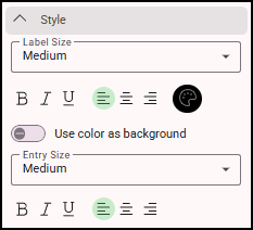
Common style options include:
-
Label Size – Choose from Extra Small, Small, Medium, Large, or Extra Large.
-
Label Formatting – Apply bold, italic, or underline to your label text.
-
Label Alignment – Align labels to the left, center, or right.
-
Label Color – Pick a custom color for the label.
-
Use Color as Background – Toggle on to apply the label color as the field’s background color.
-
Entry Size – Set the size of the input field itself.
-
Entry Alignment – Choose how the input content is aligned (left, center, or right). For example, you might right-align number fields or adjust the placement of checkboxes and radio buttons next to labels.