.png?height=120&name=OmniByte%20-%20PNG%20Black%20Logo%20Oct%202021%20(1).png)
How to add a checkbox to a form
The Checkbox input provides checkboxes for the app user to select. Checkboxes are used when more than one option can be selected, and you want all options to be presented. Click Edit to open the Edit Checkbox window. Enter a label for the group of checkboxes, then in the Options box, enter the text that will appear next to each checkbox. Put each option on a separate line.
The following outlines the best practice for using selection inputs. For more details, see Differences in Selection Inputs.
|
Input Type: |
Example: |
|
Checkbox
|
 |
|
Lookup
|
 |
|
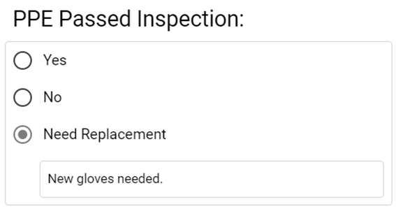
Radio
|
 |
|
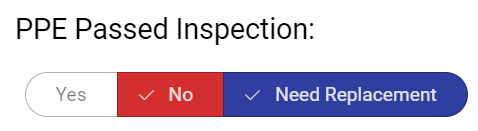
Segmented Button
|
 |
|
Select
|
 |
- From the Input menu in the Form Designer, click Checkbox.

- Click
 (Edit) to open the Edit Checkbox window.
- On the Settings tab, mark Required to make the checkbox a required field.
Mark Used for Personal Data if the checkbox field is used for personal data which can be used to delete specific data from a form. By checking this option, when using the Data Deletion page, non-personal data is kept for analysis, while deleting the personal data. After marking this option, an icon appears next to the text alignment icon in the Admin site indicating this field is used for personal data:
- Mark Read-Only to make the checkbox read-only.
- Enter a label for the checkbox.
- In the Tooltip field, enter the tip/hint you may want to include for the checkbox.
-
Mark Show Select All Checkbox to determine whether a Select All option appears for a set of checkbox inputs. This allows you to control how the mobile app users can quickly check all boxes, or individually determine whether each is marked.
Mark Add Field to Last Option to add a field next to the last checkbox which allows the mobile user to enter additional text or a number about the last option. For example, if your last checkbox is “Other, please specify.” you can use this option to add the text right next to the last checkbox. - Toggle the Displayed Value is Different than Saved Value on if you want the checkbox options to display differently than what's saved.
- Mark options as a default for the checkbox input, if a common set of checkboxes is typical for this form.
Toggle on Use Default Value, then select the options from the list you want to default when using the app. Defaults can be changed during form entry.
Mark Enter Default Value to enter a default value.
Mark Default Value from Another Field to default a value from another field. Then from the Select Form Field list, select the field you want to use to default from.
- Click the Styles tab to specify the style settings for the checkbox. See Using the Styles Tab for more information. If you justify a checkbox to the right, the box will appear to the right of the text. Checkboxes cannot be center justified.
- Click the Validations tab to create a validation for the checkbox. See Creating Field Level Validations for more information.
- Click the Field Condition tab to create a condition for the checkbox.
- Click OK to save your entries. Click Cancel to close the Edit Checkbox window without saving changes.
- Click
 (Preview) to view how the Checkbox input will look in the app. Because the Add Field to Last Option was marked in the Edit Checkbox window, there is a field after the "Other" option.