![OmniByte - PNG Black Logo Oct 2021 (1).png]](https://help.omnibyte.com/hs-fs/hubfs/OmniByte%20-%20PNG%20Black%20Logo%20Oct%202021%20(1).png?height=50&name=OmniByte%20-%20PNG%20Black%20Logo%20Oct%202021%20(1).png)
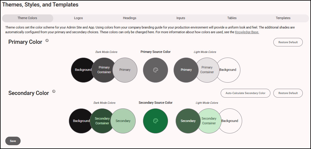
Use the Theme Colors tab to choose the primary and secondary colors for the admin site and the mobile app. These settings help create a consistent and personalized look across the platform. Any changes you make will appear in the mobile app the next time users log in or sync.
- From the Configuration menu, click Visual Settings to open the Themes, Styles, and Templates page.
-
To change a color, click the color palette in the Primary or Secondary Source Color circle and choose a new one. You can also enter an exact HEX color code to match your corporate branding colors, for example.
-
Primary Color is the main color used throughout the site. It affects the overall background and surface colors. If you reset it to default, it will go back to gray.
-
Secondary Color is used as an accent and appears less frequently. If you reset it to default, it will go back to green (FormsPro) or purple (Advanced Forms).
The additional shades are automatically generated based on your selected primary and secondary colors. The appearance of these shades, whether dark or light, adjusts according to your Admin Site color setting (dark, light, or auto). If set to auto, it will follow your browser’s theme. These colors cannot be changed.
-
- Click Auto-Calculate Secondary Color to automatically generate a secondary color that complements your selected primary color.
- Click Save. To return to the original color scheme, click Restore Default, then click Save.