![OmniByte - PNG Black Logo Oct 2021 (1).png]](https://help.omnibyte.com/hs-fs/hubfs/OmniByte%20-%20PNG%20Black%20Logo%20Oct%202021%20(1).png?height=50&name=OmniByte%20-%20PNG%20Black%20Logo%20Oct%202021%20(1).png)
The following outlines the best practice for using selection inputs. For more details, see Differences in Selection Inputs.
|
Input Type: |
Example: |
|
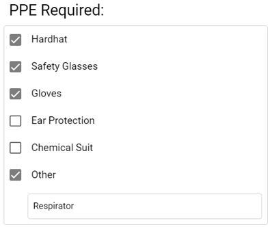
Checkbox
|
 |
|
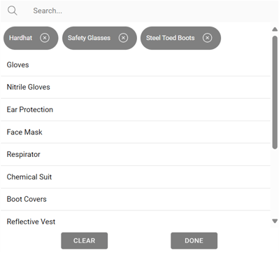
Lookup
|
 |
|
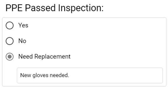
Radio
|
 |
|
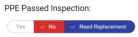
Segmented Button
|
 |
|
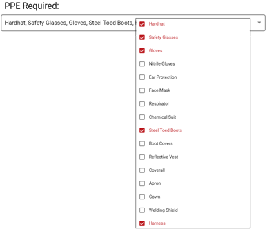
Select
|
 |
The following outlines the best practice for using selection inputs. For more details, see Differences in Selection Inputs.
|
Input Type: |
Example: |
|
Checkbox
|
|
|
Lookup
|
|
|
Radio
|
|
|
Segmented Button
|
|
|
Select
|
|