Best Practices for Using Selection Inputs
How to best use selection inputs
The following outlines the best practice for using selection inputs. For more details, see Differences in Selection Inputs.
|
Input Type:
|
Example:
|
|
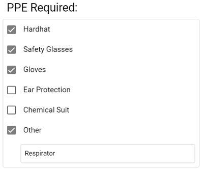
Checkbox
- Use when less than 7 options.
- All options display in app.
- Multi-selection.
- All options appear with selection marked on reports.
|
 |
|
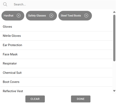
Lookup
- Use when more than 15 options.
- Search available in the app.
- Single or multi-selection.
- Only selected options are shown on reports.
|
 |
|
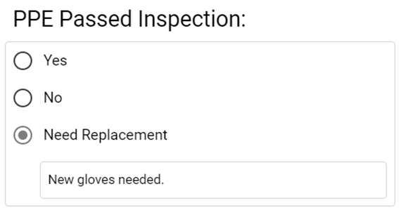
Radio
- Use when less than 7 options.
- All options visible in app.
- Select one option only.
- Marking one option unselects another option.
- Only selected option is shown on reports.
|
 |
|
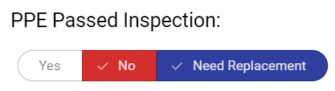
Segmented Button
- Use when 2-5 options.
- Single or multi-selection.
- All options appear on reports, with color if applicable.
|
 |
|
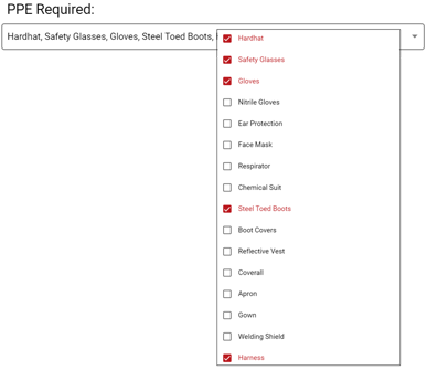
Select
- Use when 7-15+ options.
- Not all options visible.
- Uses very little space in the app.
- Single or multi-selection.
- Options containing long text may be cut off.
- Only selected options are shown on reports.
|
 |
.png?height=120&name=OmniByte%20-%20PNG%20Black%20Logo%20Oct%202021%20(1).png)