![OmniByte - PNG Black Logo Oct 2021 (1).png]](https://help.omnibyte.com/hs-fs/hubfs/OmniByte%20-%20PNG%20Black%20Logo%20Oct%202021%20(1).png?height=50&name=OmniByte%20-%20PNG%20Black%20Logo%20Oct%202021%20(1).png)
Use the Input Styles tab to customize how input labels and their text appear on your forms. You can adjust visual settings like font style (bold, italic, underline), text alignment, and label color to match your design preferences.
Text case options—such as ALL CAPS or lowercase—can also be set, along with top and bottom padding to control the spacing around input fields.
You may find it helpful to create a few different input styles for different types of fields. For example, number fields might use one style, while text fields use another. For example, you may want numbers to always be right justified and text to be left justified. You could create two or more styles to accomplish this.
As you make changes, the Input Style Preview updates in real time, allowing you to see how the input labels and their text will appear as you configure them, making it easier to fine-tune your design.
These settings help ensure a consistent and professional look across all your forms.
- From the Configuration menu, click Visual Settings to open the Themes, Styles, and Templates page.
- Click Inputs to open the Input Styles tab.
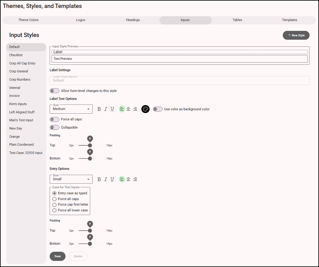
- Click + New Style to create a new input style.
- In the Label Style Name field, enter a name for the input style.
- Toggle Allow form-level changes to this style if you want form designers to be able to change inputs with this style when designing the form. When a template is applied, this option allows you to enforce or adjust style rules per form.
- Configure the default visual settings for the input. From the Size list, select the label size: Extra Large, Large, Medium, Small, or Extra Small. Specify whether the input text should be Bold, Italic, and/or Underline. Choose the text alignment: Left, Center, or Right. Finally, use the palette to select a label color.
- Toggle Use color as background color to use the selected color as the background. Turn this toggle on and off and look at the preview to determine how you prefer this setting.
- Toggle Force all caps to display the input label in uppercase.
- Toggle Collapsible to allow the app user to expand and collapse the inputs when completing the form.
- Specify the top and bottom padding to control the space between the input label and its edge.
- Configure the visual settings for the input's entry (typed entries such as text and numbers). From the Size list, select the label size: Extra Large, Large, Medium, Small, or Extra Small. Specify whether the input's entry should be Bold, Italic, and/or Underline. Choose the text alignment: Left, Center, or Right.
-
Specify the text case for input entry fields:
-
Select Entry Case as Typed to keep the text exactly as entered by the user.
-
Select Force All Caps to automatically convert all text to uppercase.
-
Select Force Cap First Letter to capitalize only the first letter of the entry.
-
Select Force All Lowercase to convert all text to lowercase.
-
- You can add top and bottom padding to your inputs to control the amount of space around them.
- Click Save to save the heading style.
- If you no longer use a heading, it can be deleted. If you delete a heading and it is part of a template it is removed from that template and from the forms that are assigned that template.